


Grial UI Kit - Carousel! (April 2024 Update)

Exciting news ahead! We've got some awesome updates to share about our product that we think you're gonna love.
Some time ago, we crafted a stylish .NET MAUI and Xamarin.Forms stacked-based infinite carousel specifically for Grial’s Demo App main dashboard (go get the app from the stores!). Although it didn't make it into our standardized Page templates initially, recent client requests have sparked our interest in making it available for wider use. And, while working on that, we asked ourselves: why don’t we create a regular Carousel that supports all the scenarios we always wanted to do but are not covered by the out-of-the-box .NET MAUI’s CarouselView? And so we did, and that’s why today we are introducing the Grial Carousel.
Note: For those that want the fancy Demo App visualization, don’t worry! it’ll be available this May!
Carousel
Our Carousel is very flexible, and provides many properties to control its looks, its behavior, and its animations! As an example, you can define a scaling factor for the previous and next element; and, when combined with the peek area looks like this:

Here are the Carousel highlights:
- Rich Animations - the Carousel comes with two different pre-baked animations that differ on how the items scaling factors update while moving
- Commands for everything -
MoveEndedCommandandPositionChangedCommandto notify ViewModels when the control did change;MoveNextCommandandMovePrevCommandto animate the carousel from a bound command - MVVM ready - the content is defined through ItemsSource and ItemTemplate properties, and it provides a variety of commands and properties to pass the Carousel state to your ViewModels and control it from C# code
- Optimized for performance - it’s 100% virtualized by default, it’s possible to opt out though
- Flexible API - loop, position, item separation, selected item, enable/disable dragging, enable/disable position changes, events and differentiated item peek percentage and scale on each side
- Progressive Animations integration - exposes
ScrollProgressproperty which enables direct integration with Grial’s Progressive Animations - Indicator view support - can be linked to an IndicatorView in the same as MAUI’s CarouselView
You can read more on the docs.
Of course, at Grial, we're not just focused on Controls. Our stunning Page Templates are the cornerstone of our products. After all, what is a control without context? That's why we chose to leverage the Carousel to address a common pattern we've encountered countless times while crafting mobile apps for our clients at UXDivers: The Registration Wizard.
Registration Wizard
Onboarding plays a pivotal role in every app's user journey. While Grial already provides beautiful onboarding options, this wizard focuses on gathering user information— a necessity for apps striving to deliver personalized experiences.

Here, you'll find a comparison between a standard registration page on the left (sampled from Tinder), one of Grial's variants in the middle, and a simple iteration achieved by using Grial’s DarkTheme, incorporating a background image, and adjusting button colors and corners:

Let’s take a look at the key aspects of the wizard:
- 7 ready-made step templates - we included entry, checkbox, date picker, country picker and more as part of the wizard; need another step? simply clone one of the existing ones and integrate your customized input fields
- C# configuration - step list, custom validations, and data collection is easily controlled and configured from the ViewModel (see Data Presenter section below to know more about this!)
- Validations - each step defines its custom validations that may prevent the user from advancing to the next step; proper feedback is always displayed
- Flexible look & feel - 2 variants are already included, and as always, achieving a radical change in look and feel is just a few property updates away, as illustrated in the image above
- Progress indicator - progress text and progress bar adjusts automatically to any number of steps, nothing required in the ViewModel for it to work
- Rich interactivity - user can use the Next button or just swipe with their finger to move between steps
We called it the Wizard Flow, since it’s a Grial Flow, and is flexible enough to be used in other scenarios beyond registration; scenarios where users are required to follow a step by step process.
Data Presenter

Have you ever wondered how to present a data object on a page outside of a list? No ItemsSource, no ItemTemplate? The DataPresenter is here to help! Let’s say you want to display a credit card bound to a Card property:
<grial:DataPresenter Data="{Binding Card}">
   <grial:DataPresenter.DataTemplate>
     <DataTemplate>
       <!-- Card visualization XAML –>
     </DataTemplate>
   </grial:DataPresenter.DataTemplate>
</grial:DataPresenter>
As simple as that. Of course, that might not sound incredibly exciting, right? But things start to get cooler when you define that DataTemplate within a resource dictionary. Then, you can use the DataPresenter to exhibit cards anywhere without the need to create a ContentView file just to store a piece of XAML with an obscure data binding contract.
Let’s go back to the Registration Wizard. While Carousel there defines a single ItemTemplate containing the card's shape, the content of each card needs to be dynamic, enabling support for any wizard a developer is tasked with implementing. In short, we need multiple content templates such as EntryTemplate, RadioTemplate, and more.
Our aim was that the wizard structure could be fully orchestrated from the ViewModel, as C# Developers feel comfortable there. This is where Templating Rules step in. With them, you can establish a set of rules to determine which DataTemplate should be used by DataPresenters, and you have the freedom to do so at any level of the Visual Hierarchy. It’s truly flexible and makes things very dynamic!
This is how you’d configure a 2-step wizard in the ViewModel:
var name = new StepEntryViewModel(
   title: "What's your name?",
   hint: "Enter your name",
   validation: ...);

var birthday = new StepDatePickerViewModel(
   title: "When's your birthday?",
   initValue: new DateTime(2000, 1, 1),
   validation: ...);

Steps = [name, birthday];
This will show an entry for the name and a date picker for the birthday. As simple as that! And no UI code involved.
You can read more on the docs.
Pricing Plan Pages
Last November, we introduced our first pricing page template as part of the Free content—the Membership Page. This triggered a wave of requests for more pages like that with different layouts. Today, we're happy to announce the arrival of a new page category: Plans.
On this occasion, we are including 4 different pages seamlessly integrated with Grial content and based on Grial’s Design System.
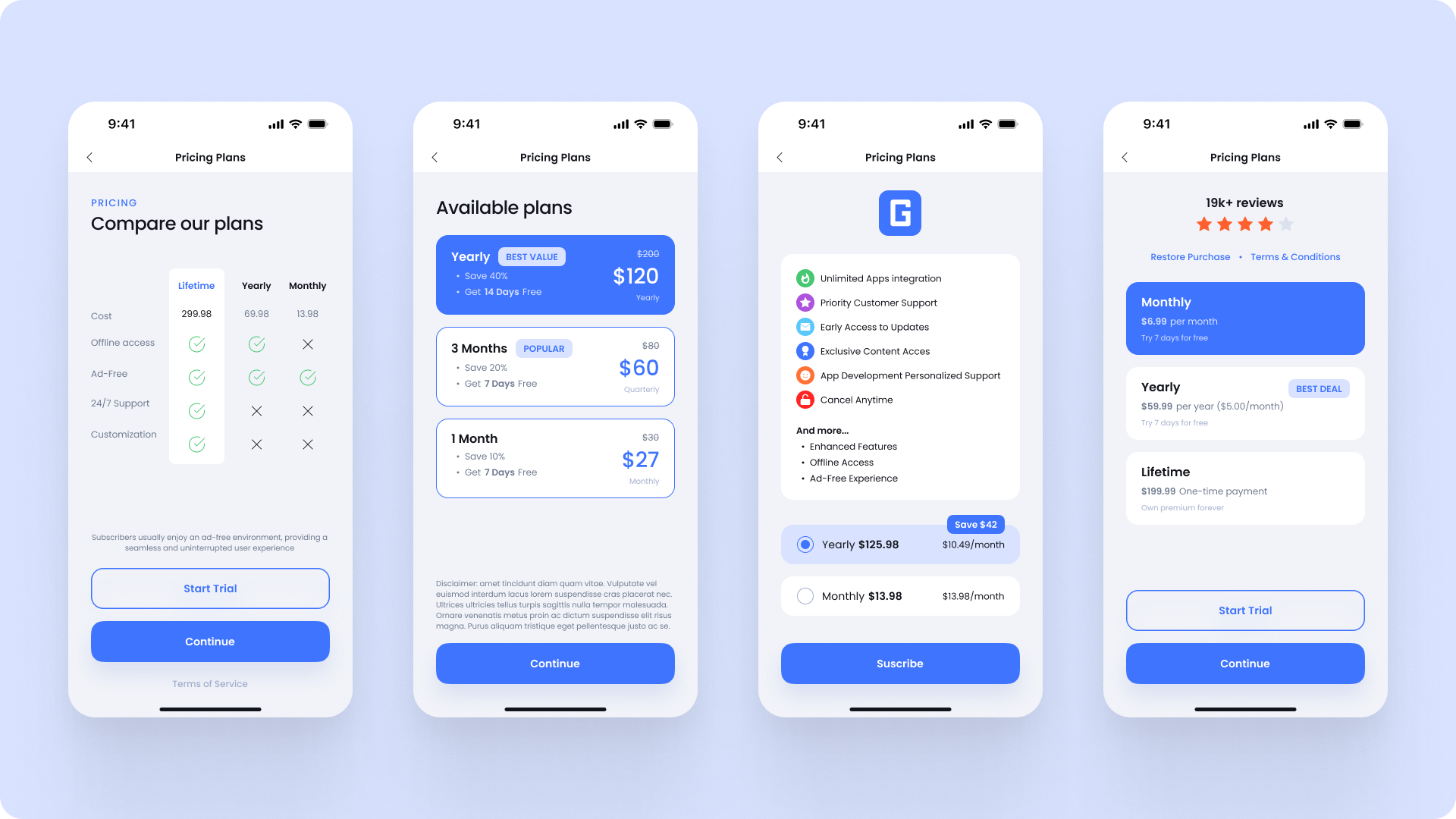
Once again, making tweaks to these pages and getting a totally different result is simple, since the XAML code is clean and well structured.
Below, you'll find another real-life example on the left (this time sourced from Glovo), one of our Grial examples in the center, and a variation achieved through simple color adjustments and a button removal:

Fluent Emoji

Grial comes with out-of-the-box support for emojis with our Emoji control. Today, we are happy to announce that we are including support of a new Family of emojis: Fluent Emoji
We've added the EmojiFamily property, giving developers the flexibility to choose between Twemoji and Fluent Emoji as they please 🎉
More goodies
Radio Buttons
This release also incorporates a .NET MAUI Radio Button style into Grial’s Design System, ensuring seamless integration with all content and maintaining a consistent look and feel across every platform.
Animation Storyboards
Now, Animation Storyboards can be used as regular resources inside ResourceDictionaries making it absolutely straight-forward to reuse them. There’s a new dictionary (AnimationResource.xaml) with a couple of reusable animations (Pulse and Vibrate) that you can use as simple as this:
grial:Animate.Tapped="{ StaticResource Animation_Pulse }"Charts improvements
Added ReferenceValueFormatter and ReferenceCount properties to charts to control how values should be displayed along the reference axis.
Bug fixes
And last but not least! Here’s a list of fixes included in this release:
- Fixed crash on Android Entries
- Fixed PinClickedCommand in GrialMap and Pin redraw on collection change
- Fixed TabItem command disabling
- Fixed issue in Drawer when the stop positions were changed dynamically.
- Fixed issue in CornerRadius effect.
- Fixed issues related to the navbar in Android: now the Flyout Page and the navbar menu items work as expected with the transparent bar.
- Fixed IsEnabled property on Checkbox and properly grabbing template parts.
- Fixed crash in Floating Menu
- Fixed border properties on entries for Android
Hope you like the new content! Stay tuned for more 🙂
Let us know if you have any feedback, and follow us here. See you next month with a new update!


Related posts


developers community.


Get it on


© 2015–2025 UXDivers | Grial


