


Deep Dive: Mastering .NET MAUI Radio Buttons

Welcome to the first article of our Deep Dives: MAUI Tips & Tricks series! In this series, we'll share a wealth of recipes, how-tos, tips, and more to help you master .NET MAUI development. We'll primarily focus on enhancing your app's UI/UX since that’s our specialty (we call ourselves UXDivers for a reason 😎). Let's dive in!
In today's blog we’ll be talking about radio buttons, since they are one of the most common user input patterns for selecting a single option among many. .NET MAUI includes the RadioButton control out-of-the-box, and although it’s very powerful, achieving its full potential could be a little tricky. Let’s see how to take full advantage of RadioButtons!
While Android features native radio buttons, iOS does not, leading to differences in the default look and feel of MAUI radio buttons across these platforms. If visual consistency is important to you, we recommend defining a generic ControlTemplate in your App.xaml and setting it in the default Style. This approach ensures a uniform appearance for radio buttons on both Android and iOS. You can get more detail in the official MS docs.
While maintaining a consistent look is important, sometimes your design may call for something more customized. For instance, you might need to include additional information for each option. Let's look at a few advanced radio button customization examples taken from Grial pricing page templates.
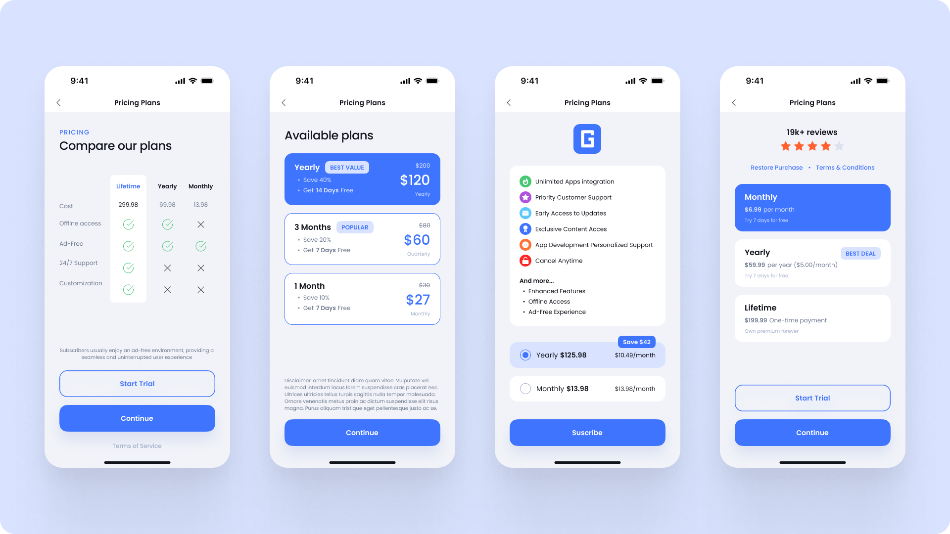
Let’s see how to get this level of customization on RadioButtons.
The first thing to note in the examples above is that each option contains a lot of information. The best way to manage this is by using a model as the BindingContext for the radio button options. This approach keeps your domain data out of the XAML code and code-behind, resulting in cleaner, more maintainable code.
Secondly, we want the options to be dynamic, so we’ll use a BindableLayout with a list bound to its ItemsSource. In this way, we can control everything from the ViewModel without touching the UI later on.
It's time to see some code! Below is the end result of the radio buttons we'll be creating:
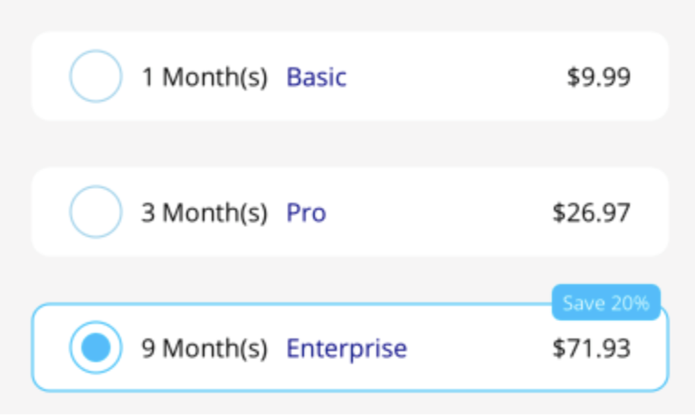
As mentioned earlier, we'll use a BindableLayout to contain the options. The RadioButtonGroup.GroupName attached property tags the inner radio buttons as part of the same group, ensuring their selection is mutually exclusive.
<VerticalStackLayout
RadioButtonGroup.GroupName="subscriptions">
</VerticalStackLayout>
Next, we'll bind the options to the ItemsSource. Since the number of radio buttons is always small, we don't need to worry about element virtualization.
<VerticalStackLayout
RadioButtonGroup.GroupName="subscriptions"
BindableLayout.ItemsSource="{ Binding Subscriptions }">
<BindableLayout.ItemTemplate>
<DataTemplate>
<local:CustomRadioButton />
</DataTemplate>
</BindableLayout.ItemTemplate>
</VerticalStackLayout>
As you can see, the template is defined in a separate file called CustomRadioButton. This file defines a RadioButton (its root XAML object) with the specific ControlTemplate we want. Let's take a look at the most relevant parts of the template.
<RadioButton>
<RadioButton.ControlTemplate>
<ControlTemplate>
<Grid
BindingContext="{ TemplateBinding BindingContext }">
<!-- Main Content -->
<Border
Stroke="{ TemplateBinding IsChecked, Converter={ StaticResource BooleanColorConverter } }">
</Border>
<!-- Discount Tag -->
<Border
IsVisible="{ TemplateBinding IsChecked }">
<!-- ... -->
</Border>
</Grid>
</ControlTemplate>
</RadioButton.ControlTemplate>
</RadioButton>
Notice that the BindingContext is set with a TemplateBinding. This technique allows us to display model values directly through regular bindings. The RadioButton also offers other properties that we can access through TemplateBindings. In particular, we'll be using the IsChecked property to update the template based on the radio button state. In this example, IsChecked controls the border color and the discount label.
That's all! That's how you can build your own highly customized radio buttons. For the full code, including the complete XAML for these templates, the model, and the ViewModel, check out this repo.
If you enjoyed this content or found it useful, please share it with your colleagues. We'd love to hear what topics you'd like us to cover next time!
You can share your feedback here or here.


Related posts

developers community.


Get it on


© 2015–2025 UXDivers | Grial


