


Basic mobile navigation patterns

Basic Patterns for Navigation (Mobile)
Navigating through mobile apps must be intuitive and predictable for both returning and first-time users.
Achieving this experience can be challenging because of the small screen size, and the fact that we might need to prioritize content over UI elements.
Numerous patterns attempt to solve this problem and they are vastly applied. We’re going to take a look at the pros and cons of three of the most commonly used ones.
Hamburger Menu
Screen space is the most valuable element in mobile apps. The Hamburger Menu (or side drawer panel) helps you maximize screen space, making it one of the most popular navigation patterns used. The drawer panel lets you hide the navigation on the side of the screen, making it available only when needed, allowing your user to focus their attention on the app’s main content.
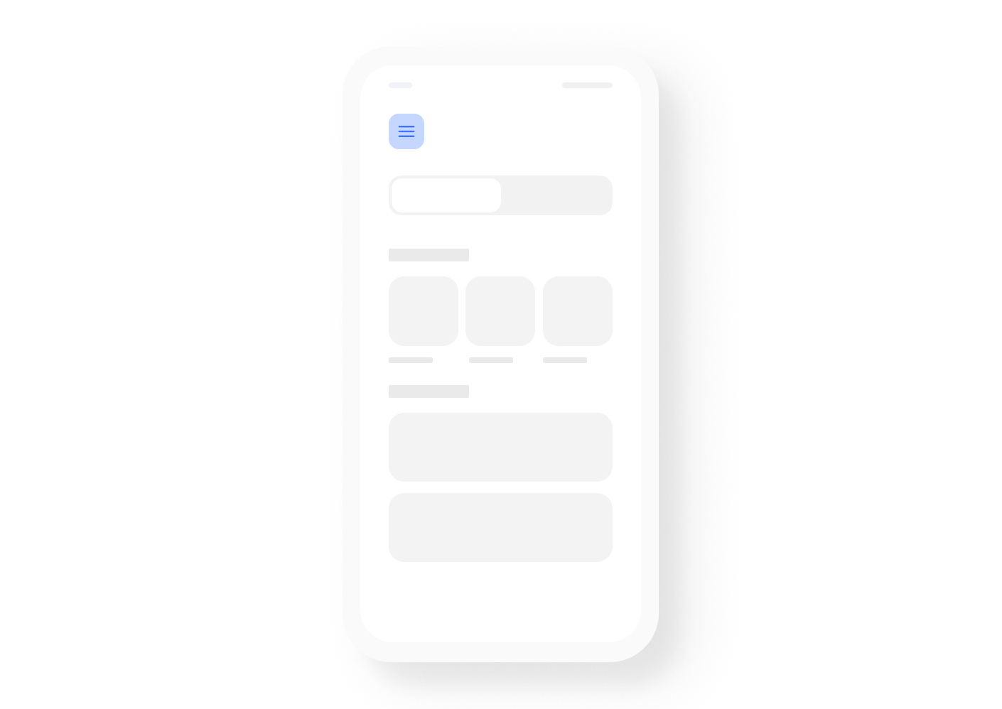
PROS
- Large number of items. This pattern can hold a large amount of items in a very small amount of space.
- Clean design. You can quickly free up space by closing the side drawer panel and opening only when needed.
CONS
- Less discoverable. As a general rule, when navigation patterns are hidden, users are less likely to find them. Although the Hamburger menu is one of the most widely used patterns, and most people are familiar with it, users might still miss key menu options if these are hidden away in the side drawer panel.
- Extra action. Navigating to a particular location usually takes at least two taps, one to expand the drawer panel, and the other to select the menu option.
Tab Bar
This pattern comes from desktop design and it’s mostly used when your app has different destinations of similar importance, and you need your user to be able to access them from anywhere within the app.
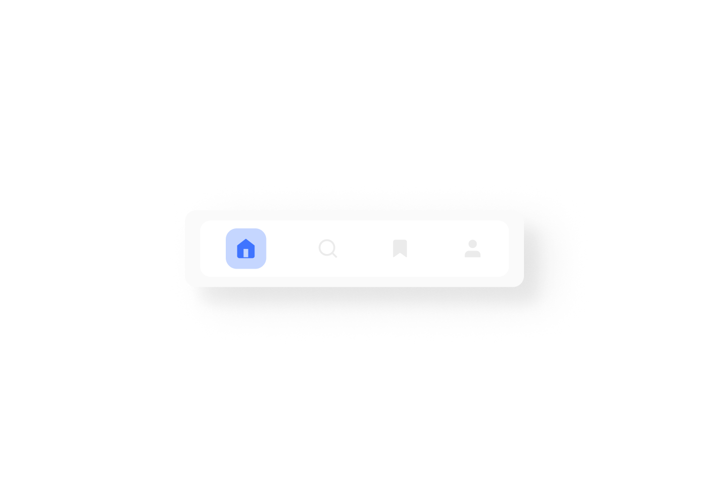
PROS
- Communicates location easily. By using the right UI elements (icons, text, colors) location becomes evident.
- Consistent. With a single tap users are able to navigate through different locations throughout the app.
CONS
- Limited number of options. If you have more than 5 options to display, it's difficult to maintain an optimum touch surface on each one of them.
- Different platform locations. Platforms have different rules for displaying some controls. Android uses tabs on the top while iOS is on the bottom.
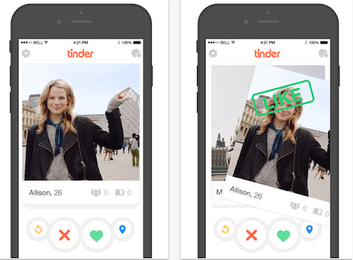
Gesture-Based Navigation
From the moment Apple launched its first touchscreen (June 29, 2007) te smartphone mobile device sphere has been dominated by touchscreen interactions.
Gestures have quickly become a popular navigation pattern in apps. Today an app’s performance dramatically depends on how well gestures are implemented into the UX.
Massively used apps, like Tinder, turn gestures like “swipe left/right” into patterns that quickly become mainstream and need to be adopted by other apps.
Tinder, for example, changed the game by introducing a new gesture that now it's pretty much a product-defined. People are used to the “swipe left” and “swipe right” gestures nowadays.
PROS
- Less UI Items present at the same time. Using gestures at the heart of the UX design removes clutter, making interfaces cleaner and saving space to display valuable content. This pattern also enables users to access a wide variety of options at will .
- Universal. According to an article by Luke Wroblewski there’s evidence that gestures tend to be shared by people of different ages and cultures, making this pattern a more universal method of navigation.
CONS
- Lack of affordance. One of the most critical rules in UI is affordance or visibility. By removing navigation elements your app UI might look more pleasant and cleaner. However, by doing so, you also run the risk of having to rely on your users’ past experience, or trial and error, to discover how to navigate the app. This means more effort on the side of the user to navigate your app.
We’ve looked at the pros and cons of three of the most widely used mobile app navigation patterns. Now, how do you decide which one is best for your app?
The Hamburger menu might be great for clean UI screens, unless users expect to find a critical option displayed on the screen instead of hidden away on the side.
Tab bars are great when you have few options that need to be accessible throughout the app. However, this might not work if the options you want to display are too many. In that case, you might want to consider splitting features in more than one app, as Facebook does with Facebook, Messenger, Pages, etc.
Gestures can be a great fit when designing an app that is geared towards users who are heavy users of apps that already rely on this navigation pattern, but what if your users aren’t?
In other words, the answer is simple and complex at the same time. Knowing what your users’ goal is when using your app, knowing industry pattern standards and trends, and testing your designs with your users, are all critical aspects of achieving intuitive and predictable navigation in your app.
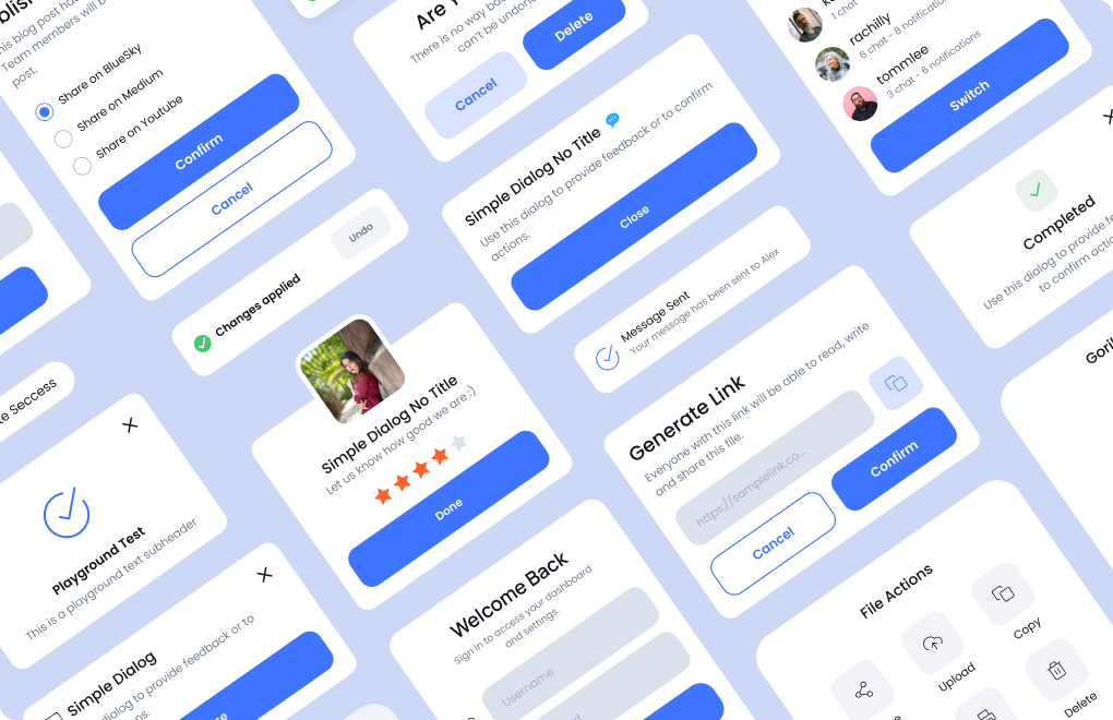
Find all this different navigations patterns examples for .NET MAUI and Xamarin.Forms on our Grial UI Kit demo app on the stores.
Grial UI Kit for iOS and Grial UI Kit for Android.
Thanks for reading!


Related posts

developers community.


Get it on


© 2015–2025 UXDivers | Grial


